You’ve seen it before. A brand that feels like it’s from the 1980s, but somehow also from the year 3000. That’s retro-futurism. It’s not just nostalgia — it’s a deliberate collision of old-school aesthetics and imagined tomorrows. And honestly, it’s everywhere right now.
From tech startups to fashion labels, brands are borrowing visions of the future that never quite happened. You know — the chrome, the neon, the rounded fonts, the pixelated graphics. But why? And how do you pull it off without looking like a cheap sci-fi knockoff?
Let’s break it down. No fluff, just the good stuff.
What is retro-futurism, exactly?
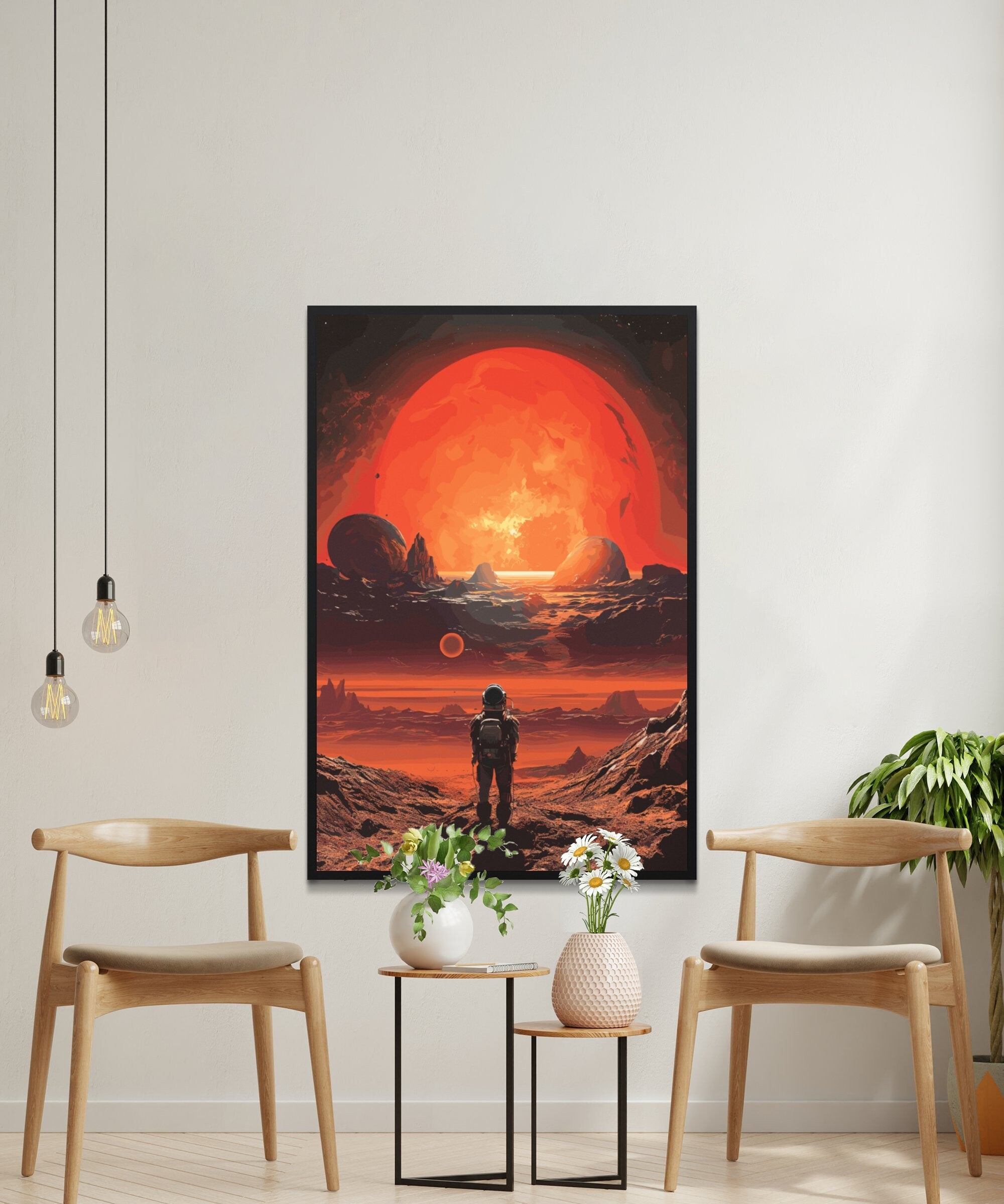
Retro-futurism is a creative style that reimagines how people in the past thought the future would look. It’s a bit like peeking into a time capsule that never got buried. Think Jetsons meets Blade Runner — but with a modern twist.
In brand visual identity, this means using design cues from the 1950s, 60s, 70s, or 80s, but layering in futuristic elements. It’s a mashup of nostalgia and innovation. And it works because it feels familiar yet fresh.
Why brands are jumping on the retro-futurism bandwagon
Here’s the deal: consumers are tired of sterile, minimalist design. You know, the all-white websites, the sans-serif fonts, the “clean” look that feels a bit… cold. Retro-futurism offers warmth. It offers personality. It offers a story.
Plus, it taps into a deep well of cultural memory. When you see a grainy, VHS-style filter on a brand’s video, you don’t just see a filter — you feel the Saturday mornings of your childhood. That emotional hook is powerful.
And let’s be real — it’s also just fun. In a world of serious corporate branding, a little whimsy goes a long way.
Key visual elements of retro-futurism in branding
So what actually makes a brand look “retro-futuristic”? It’s not one single thing — it’s a combination of choices. Here are the heavy hitters:
- Color palettes: Neon pinks, electric blues, acid greens, and deep purples. Think Tron or a sunset on Mars. But also muted pastels if you’re going for a 1950s “future” vibe.
- Typography: Rounded, geometric fonts with a slight sci-fi edge. Or sharp, angular lettering that feels like it belongs on a spaceship control panel.
- Gradients and glows: Lots of soft, glowing transitions. Chrome effects. Light leaks. That “synthwave” sunset gradient is a classic.
- Pixel art and low-res graphics: Intentional roughness. Think 8-bit sprites or early CGI aesthetics — the kind of thing that looks “old” but also oddly futuristic.
- Metallic textures: Silver, chrome, brushed aluminum. It screams “space age” without screaming too loud.
- Grids and geometric patterns: Endless grids, neon lines, and perspective tricks that make you feel like you’re zooming through a digital landscape.
Real-world examples that nail it
Let’s look at a few brands that are doing retro-futurism right. Not just for the aesthetic, but for the message.
1. Spotify’s “Wrapped” campaigns
Every year, Spotify’s Wrapped design leans into retro-futurism. Bright neon gradients, pixelated fonts, and a kind of arcade-game energy. It’s playful, it’s personal, and it makes you feel like you’re part of something bigger — like a digital time traveler.
2. Nike’s “Air Max” retro campaigns
Nike often uses retro-futuristic imagery for its Air Max lines. Think chrome swooshes, neon accents, and ad copy that sounds like it’s from a 1980s tech manual. It connects the brand’s heritage with its forward-looking innovation.
3. Stranger Things (and its brand collaborations)
The show itself is a masterclass in retro-futurism. But its brand partnerships — with everything from Coca-Cola to Burger King — use the same visual language. Neon signs, grainy textures, and a sense of “what if the 80s never ended?”
How to apply retro-futurism to your brand (without overdoing it)
Alright, so you’re sold on the idea. But how do you actually use it? Here’s a quick roadmap — think of it as a checklist, not a rulebook.
- Start with your brand’s story. Retro-futurism works best when it echoes a genuine narrative. Are you a tech company that wants to evoke early internet optimism? A fashion label channeling 1970s space-age glamour? Let the story guide the style.
- Pick one or two elements. Don’t go full neon chrome on everything. Maybe it’s just your typography and a few gradients. Subtlety is your friend — unless you’re going for maximalist chaos, which can also work.
- Balance old and new. The magic is in the tension. Pair a retro font with a modern layout. Use a pixelated icon next to a high-res photo. That contrast is what makes it interesting.
- Test with your audience. Not every demographic loves nostalgia. Gen Z, for instance, might see retro-futurism as ironic or even cringe — but that can be a feature, not a bug. Know your crowd.
- Keep it functional. Sure, it looks cool. But does your logo still scale down to a favicon? Does your website load fast? Retro-futurism shouldn’t sacrifice usability.
Common pitfalls to avoid
Even the best trends can go wrong. Here’s what to watch out for:
- Cliché overload: Too many neon grids and cassette tapes, and you’ll look like a generic synthwave poster. Add your own twist.
- Inconsistency: If your website is retro-futuristic but your social media is flat and modern, it’s confusing. Pick a lane — at least for a campaign.
- Forgetting the “future” part: Retro-futurism isn’t just retro. It’s about looking forward. If your design only feels nostalgic, you’ve missed the point.
- Ignoring accessibility: Neon on dark backgrounds looks amazing, but it can be hard to read. Always check contrast ratios.
Retro-futurism vs. other trends: a quick comparison
It helps to see how retro-futurism stacks up against similar styles. Here’s a simple table:
| Style | Vibe | Key colors | Example |
|---|---|---|---|
| Retro-futurism | Nostalgic but forward-looking | Neons, chrome, pastels | Spotify Wrapped |
| Cyberpunk | Gritty, dystopian | Dark blues, reds, black | Blade Runner |
| Minimalism | Clean, simple | White, gray, beige | Apple (early 2000s) |
| Maximalism | Bold, chaotic | Everything | Gucci (some eras) |
Notice how retro-futurism sits in a sweet spot — it’s not too dark, not too sparse. It’s optimistic, even a little cheeky.
The psychology behind the trend
Why does retro-futurism resonate so deeply? Well, part of it is about control. The future feels uncertain right now — climate change, AI, political turmoil. But retro-futurism offers a version of the future that’s simpler, more playful. It’s a future we can handle.
Another angle: it’s a rebellion against perfection. The glossy, airbrushed future of the 1950s never arrived. So instead, we embrace the glitches, the grain, the imperfections. That feels more honest, you know?
And honestly, there’s a bit of irony in it. Using retro-futurism says, “We know the future didn’t turn out like this — but let’s pretend for a minute.” It’s a wink to the audience.
Tools and resources for creating retro-futuristic visuals
If you’re ready to experiment, here are a few tools that can help — no design degree required:
- Canva: Has templates with neon gradients and retro fonts. Good for quick mockups.
- Figma or Adobe Illustrator: For custom work. Use plugins like “Neon” or “Chrome Effect.”
- Photopea: Free online editor with filter options for glitch and VHS effects.
- Fonts in the wild: Try “Orbitron,” “Audiowide,” or “Press Start 2P” for that retro-futuristic typeface feel.
- Color palette generators: Look for “synthwave” or “vaporwave” presets on Coolors or Adobe Color.
When retro-futurism might not work
Let’s be honest — it’s not for everyone. If your brand is about serious, traditional values (think law firms, insurance, or luxury watches), retro-futurism could feel out of place. It’s inherently playful, even a little rebellious. That’s its charm, but also its limitation.
Also, if your audience skews older, they might not connect with the “retro” part — because they lived through it. For them, it’s not nostalgia; it’s just… old. So know your demographic.
Related posts
-

Sustainability marketing for eco-conscious Gen Z
Let’s be real for a second. Gen Z isn’t just another demographic. They’re a force. They... -
Building a Marketing Strategy for the Spatial Web and Immersive Digital Environments
Let’s be honest, the marketing landscape is shifting under our feet. Again. Just as we got... -

Marketing for the Functional Nutrition and Personalized Wellness Industry: A Human-Centric Guide
Let’s be honest. Marketing in the functional nutrition and personalized wellness space is… different. You’re not...